Demo
简单 CSS 实现暗黑模式
解释:
invert 将所有色值反转,hue-rotate 将黑白以外的其它主色调再反转回来(防止页面主题色出现大的变化);
网上的 invert 通常取值为 100%,但是这样反转得到的黑色往往太过黑,眼睛看起来有点累,因此我觉得 90% 是一个更合理的值;
将图片、视频等其它不需要被反转的元素再反转回来,并加一个透明度,让其不那么刺眼;
如果 html 反转 90%,则图片等元素需要反转 110%;
css
@media (prefers-color-scheme: dark) {
  html {
    filter: invert(90%) hue-rotate(180deg);
  }

  img,
  video,
  svg,
  div[class*='language-'] {
    filter: invert(110%) hue-rotate(180deg);
    opacity: 0.8;
  }
}
css 实现圆形渐变进度条
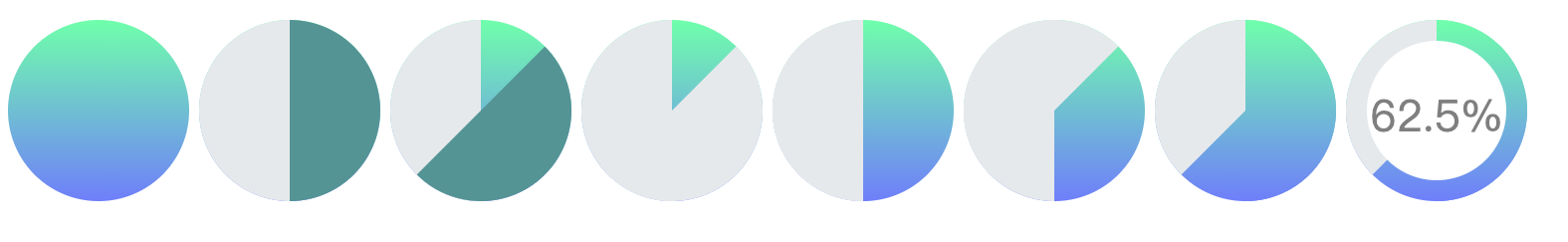
实现思路
- 最外面是一个大圆(渐变色)
- 内部里面绘制两个半圆,将渐变的圆遮住(为了看起来明显,左右两侧颜色不一样,设置为灰蓝)
- 顺时针旋转右侧蓝色的半圆,下面渐变的圆会暴露出来,比如旋转 45 度(45/360 = 12.5%),再将蓝色的右半圆设为灰色,一个 12.5 的饼图就绘制出来了。
- 尝试旋转更大的度数,旋转 180 度之后右半圆重合,再旋转,度数好像越来越小,不符合我们需求,应该将右侧的圆回归原位,把其背景色设置成和底色一样的,顺时针旋转左侧的半圆,
- 最后,最里面加上白色的小圆,放到正中间,用来显示百分数
如图所示:
clip: rect(top right bottom left);: 裁切元素,只对 absolute 有效,top right bottom left 分别指最终剪裁可见区域的上边,右边,下边与左边。而所有的数值都表示位置,且是相对于原始元素的左上角而言的。 根据上面对 top right bottom left 的释义,如果 left >= right 或者 bottom <= top,则元素会被完全裁掉而不可见,即“隐藏”。
html
<!DOCTYPE html>
<html lang="en">
  <head>
    <meta charset="UTF-8" />
    <title>圆形进度条</title>
    <style>
      /*思路https://blog.csdn.net/weixin_36894745/article/details/108758847*/
      * {
        box-sizing: border-box;
      }

      .circle-bar {
        margin-top: 100px;
        background-image: linear-gradient(#7affaf, #7a88ff);
        width: 200px;
        height: 200px;
        position: relative;
        border-radius: 50%;
      }

      .circle-bar-c {
        width: 200px;
        height: 200px;
        position: absolute;
        border-radius: 50%;
      }

      .circle-bar-left {
        background: #e9ecef;
        clip: rect(0, 100px, auto, 0); /*绘制半圆*/
        transform: rotate(0deg);
      }

      .circle-bar-right {
        background: #e9ecef;
        clip: rect(0, auto, auto, 100px);
        transform: rotate(0deg);
      }

      .mask {
        width: 150px;
        height: 150px;
        background-color: #fff;
        position: absolute;
        top: 50%;
        left: 50%;
        transform: translate(-50%, -50%);
        border-radius: 50%;
        display: flex;
        justify-content: center;
        align-items: center;
      }

      .mask > .percent {
        font-size: 16px;
      }
    </style>
  </head>
  <body>
    <div class="circle-bar">
      <div class="circle-bar-c circle-bar-left"></div>
      <div class="circle-bar-c circle-bar-right"></div>
      <div class="mask">
        <p class="percent">0%</p>
      </div>
    </div>
    <button onclick="startLoading()">start</button>
    <div></div>
    <button onclick="reset()">rest</button>
    <script>
      const circleLeft = document.querySelector('.circle-bar-left')
      const circleRight = document.querySelector('.circle-bar-right')
      const percent = document.querySelector('.percent')
      const backgroundCon = 'linear-gradient(#7affaf, #7a88ff)'

      let start = null
      const time = 5 * 1000

      function setPercent(timestamp) {
        if (!start) start = timestamp
        const elapsed = timestamp - start
        const per = Math.min(((elapsed / time) * 100).toFixed(2), 100)
        console.log(per)
        percent.textContent = per + '%'
        if (per === 0) {
        }
        if (per <= 50) {
          circleRight.style.setProperty('background', '#e9ecef')
          circleRight.style.setProperty(
            'transform',
            `rotate(${(per * 360) / 100 + 'deg'})`
          )
        } else {
          circleRight.style.setProperty('background-image', backgroundCon)
          circleRight.style.setProperty('transform', 'rotate(0)')
          circleLeft.style.setProperty(
            'transform',
            `rotate(${((per - 50) * 360) / 100 + 'deg'})`
          )
        }
        if (elapsed < time) {
          // 在两秒后停止动画
          window.requestAnimationFrame(setPercent)
        }
      }

      function startLoading() {
        window.requestAnimationFrame(setPercent)
      }

      function reset() {
        start = null
        circleLeft.style.setProperty('background', '#e9ecef')
        circleLeft.style.setProperty('transform', 'rotate(0)')
        circleRight.style.setProperty('background', '#e9ecef')
        circleRight.style.setProperty('transform', 'rotate(0)')
        percent.textContent = 0 + '%'
      }
    </script>
  </body>
</html>
B 站的弹幕不遮挡人物效果
只要在视频播放的时候把人物的轮廓填充透明其他地方填充颜色即可,实现这样的一个功能就需要引入tensorflowjs,使用官方训练好的人体分割(Body Segmentation)模型,在视频播放时将每一帧生成一直图片,放到弹幕的父元素上。 使用 css 特性: