前端组件库的设计原则
细粒度的考量
从软件的设计模式上,确定组件的单一职责原则,原则上一个组件只专注一件事情,单一职责的组件的好处很明显,由于职责单一就可以最大可能性地复用组件。保证组件单一的最大好处就是方便单元测试。 同时要考虑划分过细而导致组件碎片化的问题。
通用性考量
组件的形态(DOM结构)永远是千变万化的,但是其行为(逻辑)是固定的,因此通用组件的秘诀之一就是将 DOM 结构的控制权交给开发者,组件只负责行为和最基本的 DOM 结构。
预留合适的api,或者叫pros等,比如提供自定义渲染render,提过组件核心能力的同事也能根据业务上进行扩展。
原子性设计
比如样式主题,在sketch文件中将最小颗粒度“原子(如颜色)”按照其使用意图作为名称进行命名;颗粒度再复杂一级的“分子(如字体)”变量名则由typeface/weight/color/size的组合排列产生。
控制反转设计IOC
不是从上层开始使用底层构建或者组装依赖。而是从底层开始设计叠加,感觉有点像是从递归到动态规划的过程。比较明显的一个就是React中的高阶组件(HOC)
基于Sketch中的symbol功能,前端也需要将组件进行原子化,并根据symbol的变量命名将常用的大小、颜色创建为变量。
前端组件根据功能以及颗粒度可以分为“基础组件”和“高阶组件”。基础组件一般是页面中颗粒度中最小也是最常用的组件,例如input,button等;高阶组件通常是由基础组件进行一定的变形、组合或两者兼有而形成的;而高阶组件+基础组件最终组成了完整的页面。 为了满足2B场景下的整体风格替换,所有组件在开发的时候要将用到的颜色、字体等"原子"用变量的方式引入。
在目前前端开发中,样式的变量创建方式主要有两种:一是基于css原生支持的自定义变量,二是基于less、scss等css预编译器。考虑到自定义变量可能存在的浏览器兼容性问题,组件库可以采用了less作为样式开发的语言。less 是一门 CSS 预处理语言,除了之前提到的变量功能,还有嵌套、混合(mixin)、函数等方便的功能。
前端组件设计原则
- 层次结构和 UML 类图
- 扁平化、面向数据的 state/props
- 更加纯粹的
State变化 - 高内聚,低耦合
- 辅助代码分离
- 提炼精华
- 及时模块化
- 集中/统一的状态管理
原子化设计
原子设计是一种方法论,由原子、分子、组织、模板和页面共同协作以创造出更有效的用户界面系统的一种设计方法。
原子设计的五个阶段分别是:
- Atoms原子。 为网页构成的基本元素。例如标签、输入,或是一个按钮,也可以为抽象的概念,例如字体、色调等。
- Molecules分子。 由原子构成的简单UI组件。例如,一个表单标签,搜索框和按钮共同打造了一个搜索表单分子。
- Organisms组织。 由原子及分子组成的相对复杂的UI构成物
- Templates模版。 将以上元素进行排版,显示设计的底层内容结构。
- Pages页面。 将实际内容(图片、文章等)套件在特定模板,页面是模板的具体实例
How to build a component library
Modern Library Feature
- Output to
esm,cjs, andumdformats - Support tree-shaking, output
esmcan cover it(ifcss-in-js) - Output to multiple files(folder to folder, file to file)
- Better tree-shaking by maintaining the file structure
- This makes it easier to mark specific files as having side effects, which helps the developer's bundler with tree-shaking
- Support TypeScript types
build output
key feature:
- Dead code elimination, or Tree shaking, as it’s often called, is very important to achieve the optimum bundle size and hence app performance.
webpack vs rollup
Use webpack for apps, and Rollup for libraries
- output to
ESMformats still is an experimental feature in webpack latest version(5.74.0), output.library.type
scope
how to build a React component library
ways
rollup
tsc
glup + babel
third package
babel
example
Mui
@emotion, css in js, "sideEffects": false,
- use rollup to bundle umd format output
- use tsc to build type
- use babel to build esm/cjs, folder structure
chakra-ui
turborepo + pnpm workspace, each component is a package. gather in @chakra-ui/react as dependencies and use tsup to bundle component
@emotion, css in js, "sideEffects": false,
folder structure
├── package
│ ├── components
│ │ ├── button
│ │ │ ├── src
│ │ │ ├── **tests**
│ │ │ ├── **stories**
│ │ │ ├── index.ts
│ │ │ ├── package.json
│ │ │ ├── tsconfig.json
│ │ │ ├── tsup.config.ts
│ │ ├── react
│ │ │ ├── src
│ │ │ ├── **tests**
│ │ │ ├── index.ts
│ │ │ ├── package.json
│ │ │ ├── tsconfig.json
│ │ │ ├── tsup.config.ts
tsup.config.ts each component is same
import { defineConfig } from 'tsup'
import { findUpSync } from 'find-up'

export default defineConfig({
  clean: true,
  format: ['cjs', 'esm'],
  outExtension(ctx) {
    return { js: `.${ctx.format}.js` }
  },
  inject: process.env.JSX ? [findUpSync('react-shim.js')!] : undefined
})
naive-ui
- use rollup to bundle umd format output
- use tsc to build esm and cjs folder structure, tsc can do this
tsconfig.esm.json
{
  extends: './tsconfig.json',
  exclude: ['**/*.spec.ts'],
  include: ['src/components'],
  compilerOptions: {
    declaration: true,
    noEmit: false,
    rootDir: './src/components',
    outDir: './es',
    // cjs CommonJs
    module: 'ES6',
    target: 'ES6'
  }
}
ant-design
antd-tools: glup + babel
less config
{
  "sideEffects": ["dist/*", "es/**/style/*", "lib/**/style/*", ".less"]
}
Headless components/UI
- Good example: TanStack Table Can know more.
- 全新的 React 组件设计理念 Headless UI
- Headless Component: a pattern for composing React UIs
- shadcn/ui Re-usable components built using Radix UI and Tailwind CSS. 不是通过npm安装而是直接Pick the components you need. Copy and paste the code into your project and customize to your needs.
The libraries will give you well tested and accessible components or hooks without any default styling, so you can style and render them however you’d like, and if the authors were kind enough — you’ll also be able to control their functionality and behavior.
When building design system, these requirements need answer:
- Accessibility: the components must be accessible.
- Theming: each component should support multiple themes (light mode\dark mode for example).
- Uniqueness: The look of our product should be unique. We don’t want our product to have that Material (or Bootstrap) generic look and feel. We have a design team, and they determine how our product should look like.
- Browser support: it should support all major browsers.
- Functionality: We need complete control on how our components behave.
- Responsiveness — it should support all screen sizes and devices.
- Maintainability: it should be easy and seamless to modify and maintain.
shadcn/ui
Shadcn UI 组件的通用架构如下:
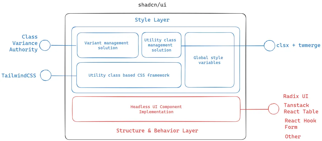
shadcn/ui基于核心原则构建,即组件的设计应与其实现分开。因此,shadcn/ui中的每个组件都具有两层架构。即:
- 结构和行为层
- 样式层